How to Easily Display a Modal Screen Using Bootstrap
In web development, a modal screen is a useful UI component for displaying information and interacting with users.
This article provides an easy-to-understand explanation of how to implement a modal screen using Bootstrap.
Bootstrap is a framework that allows you to quickly create sophisticated designs using CSS and JavaScript.
CSS Code to Easily Display a Modal Screen Using Bootstrap
First, load Bootstrap’s CSS (bootstrap.min.css file). By using a CDN, you can easily include the latest version of Bootstrap in your project.
<!-- CSS only -->
<link href="https://cdn.jsdelivr.net/npm/bootstrap@5.0.2/dist/css/bootstrap.min.css" rel="stylesheet" integrity="sha384-EVSTQN3/azprG1Anm3QDgpJLIm9Nao0Yz1ztcQTwFspd3yD65VohhpuuCOmLASjC" crossorigin="anonymous">
By adding this code inside the <head> tag of your HTML, you can use Bootstrap styles.
JavaScript Code to Easily Display a Modal Screen Using Bootstrap
Next, load the JavaScript (bootstrap.bundle.min.js file) required to operate the modal screen.
Bootstrap’s JavaScript features can also be added easily via CDN.
<!-- JavaScript Bundle with Popper -->
<script src="https://cdn.jsdelivr.net/npm/bootstrap@5.0.2/dist/js/bootstrap.bundle.min.js" integrity="sha384-MrcW6ZMFYlzcLA8Nl+NtUVF0sA7MsXsP1UyJoMp4YLEuNSfAP+JcXn/tWtIaxVXM" crossorigin="anonymous"></script>
HTML Code to Easily Display a Modal Screen Using Bootstrap
Create the HTML structure for the modal screen. Below is the HTML code for a button that triggers the modal and the modal itself.
Using the button element with data-bs-toggle="modal" defines it as a modal trigger button, and
data-bs-target="#staticBackdrop" specifies the ID of the target modal.
In the modal screen with id="staticBackdrop", the class "modal fade" defines the modal styling.
data-bs-backdrop and data-bs-keyboard control how the modal behaves.
Feel free to change these settings as needed.
<h1 class="text-center pt-5">Click the "Show Modal Screen" button to display the modal.</h1>
<div class="text-center pt-5">
<button type="button" class="btn btn-primary" data-bs-toggle="modal" data-bs-target="#staticBackdrop">
Show Modal Screen
</button>
</div>
<!-- Modal -->
<div class="modal fade" id="staticBackdrop" data-bs-backdrop="static" data-bs-keyboard="false" tabindex="-1" aria-labelledby="staticBackdropLabel" aria-hidden="true">
<div class="modal-dialog">
<div class="modal-content">
<div class="modal-header">
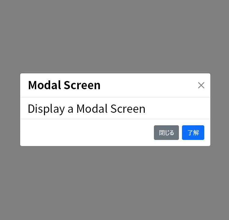
<h5 class="modal-title" id="staticBackdropLabel">Modal Screen</h5>
<button type="button" class="btn-close" data-bs-dismiss="modal" aria-label="Close"></button>
</div>
<div class="modal-body">
Click the "×" button in the top right or the "Close" button below to close the modal.
</div>
<div class="modal-footer">
<button type="button" class="btn btn-secondary" data-bs-dismiss="modal">Close</button>
<button type="button" class="btn btn-primary">OK</button>
</div>
</div>
</div>
</div>
With this code, you can easily display a modal screen.
You can modify the button styles and text as needed.
Demo Page: Modal Screen Display Using Bootstrap
You can view the working demo page from the link below.
Demo Page: Modal Screen Display Using Bootstrap
Source: Modal · Bootstrap
This content is based on the official Bootstrap documentation.
Please refer to the link below for more detailed information.
Conclusion
By using Bootstrap, you can easily implement modal screens with CSS and JavaScript.
This enhances user experience and helps you build attractive web applications.
Use this article as a reference and try creating your own modal screens!
*Use at your own risk if you reuse this content.
Please do not reuse the Google Analytics tag in the <head> of the demo page.