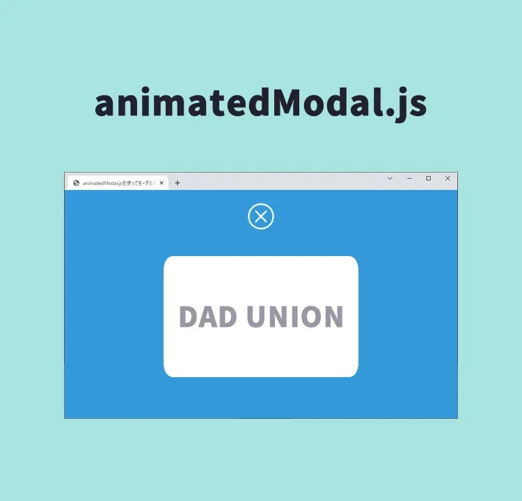
Beginner Friendly! A Complete Guide to Easily Creating Attractive Animated Modals with animatedModal.js
In the field of web development, modal windows are frequently used as elements to capture users’ attention.
This time, we will clearly explain the specific implementation method using animatedModal.js, a JavaScript library specialized in modal displays with animations. By doing so, you can enhance the user experience.
Introduction
animatedModal.js is a JavaScript library that allows you to apply simple yet effective animation effects to modal windows. With this library, you can set various animations for opening and closing modal windows. In this article, we will carefully explain everything from the basic introduction method to customization examples.
Required Files
Before using animatedModal.js, you need to add the following files to your project:
- animate.min.css – Stylesheet for animation effects
- jQuery – JavaScript library
- animatedModal.js – Script that adds animation features to the modal
Basic HTML Structure
First, prepare the HTML markup to run the modal window. You need a link that triggers the modal and a container that holds the modal content.
Prepare the modal display links (id=”demo01″, id=”demo02″) and modal areas (id=”demo1-modal”, id=”demo2-modal”). The href of the modal display link tags (href=”#demo1-modal”, href=”#demo2-modal”) must match the id of the modal areas (id=”demo1-modal”, id=”demo2-modal”).
<h1>Display a Modal Screen with Animation Using animatedModal.js</h1>

<div><a id="demo01" href="#demo1-modal">Click here to display Modal 1</a></div>
<br>
<div><a id="demo02" href="#demo2-modal">Click here to display Modal 2</a></div>

<div id="demo1-modal">
  <div  id="btn-close-modal" class="close-demo1-modal">
  Click here to CLOSE Modal 1
  </div>

  <div class="modal-content">
  This is the content area of Modal 1.
  </div>
</div>


<div id="demo2-modal">
  <div  id="btn-close-modal" class="close-demo2-modal">
  Click here to CLOSE Modal 2
  </div>

  <div class="modal-content">
  This is the content area of Modal 2.
  </div>
</div>
CSS Settings
Apply the basic styling for modal windows and buttons. Here, we will use animate.min.css to prepare for the animations.
“#btn-close-modal” is the CSS description for the modal area’s close button.
<link rel="stylesheet" href="animate.min.css">
<style>
* {
  padding: 0;
  margin: 0;
}
body {
  font-size: 18px;
  text-align: center;
}
h1{
  text-align: center;
  font-size: 24px;
  padding: 20px 0 40px 0;
}
#btn-close-modal {
  width:100%;
  text-align: center;
  cursor:pointer;
  color:#fff;
  text-decoration: underline;
  padding: 20px 0 40px 0;
}
</style>
JavaScript Implementation
After loading the jquery-3.4.1.min.js file and animatedModal.js, describe the specific animation settings in JavaScript. Here, you can specify the animation types with animatedIn and animatedOut.
Specify $(“modal area id”).animatedModal(options). With options, you can set the display effects of the modal screen and the processes before/after opening and before/after closing.
<script src="jquery-3.4.1.min.js"></script>
<script src="animatedModal.js"></script>
<script>
$("#demo01").animatedModal();

$("#demo02").animatedModal({
  animatedIn:'lightSpeedIn',
  animatedOut:'bounceOutDown',
  color:'#3498db',
  // Write processes here for before/after modal open and before/after CLOSE
  beforeOpen: function() {
  },
  afterOpen: function() {
  },
  beforeClose: function() {
  },
  afterClose: function() {
  }
});
</script>
Demo Page: Display a Modal Screen with Animation Using animatedModal.js
Here is the link to access the demo page where these codes are actually running:
Demo Page: Display a Modal Screen with Animation Using animatedModal.js
Source: animatedModal.js
Here is the link to access the detailed documentation of animatedModal.js:
Conclusion
In this article, we introduced how to easily implement attractive animated modal windows using animatedModal.js. Even beginners can use it easily, and it can significantly improve the user experience of your site. Be sure to give it a try.
*If you reuse it, please do so at your own responsibility.
Do not reuse the Google Analytics tag in the head tag of the demo page.