How to Create a Button Area with Arrows Using Only CSS【Copy & Paste OK】
The “button area” used on websites and landing pages is one of the key elements that can affect click-through rates depending on its appearance and animation. Adding decorations such as arrows makes the button visually intuitive and encourages user interaction.
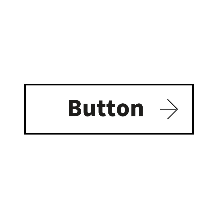
In this article, we will show you how to create a simple yet stylish “arrowed button area” using only CSS. We’ll also add a hover effect that reverses the button color using transform, making it more interactive. The arrow (→) appears within the button area, and on hover, the colors are reversed using transform.
We’ve prepared copy-paste-ready CSS code, so anyone with a basic understanding of HTML and CSS can easily implement it. Try using it on your site!
CSS Code for Creating a Button Area with Arrows Using Only CSS
* This is the CSS code for the button area (a.btn). Arrows (→) and color inversion on hover are implemented using transform. Please adjust button area size, font size, colors, etc. as needed.
<style>
body{
  text-align: center;
  font-size: 28px;
  line-height: 1.8em;
  font-weight: bold;
}
h1{
  line-height:1.6em;
  text-align:center;
  font-weight:normal;
  padding:15px 0 30px 0;
  font-size: 16px;
}

/*** CSS for button area ***/
a.btn{
  display: block;
  width: 200px;
  height: 60px;
  margin: 0 auto;
  color: #000000;
  border: solid 2px #000000;
  box-sizing: border-box;
  line-height: 58px;
  text-align: center;
  font-size: 20px;
  font-weight: bold;
  text-decoration: none;
  position: relative;
  -webkit-transition: 0.3s;
  transition: 0.3s;
}
a.btn::before,
a.btn::after{
  position: absolute;
  top: 0;
  bottom: 0;
  margin: auto;
  content: "";
  vertical-align: middle;
  -webkit-transition: 0.3s;
  transition: 0.3s;
}
a.btn::before{
  right: 19px;
  width: 19px;
  height: 1px;
  background: #000000;
}
a.btn::after{
  right: 20px;
  width: 16px;
  height: 16px;
  border-top: 1px solid #000000;
  border-right: 1px solid #000000;
  -webkit-transform: rotate(45deg);
  transform: rotate(45deg);
}
a.btn:hover{
  background-color: #000000;
  color: #ffffff;
}
a.btn:hover::before{
  background: #ffffff;
}
a.btn:hover::after{
  border-top: 1px solid #ffffff;
  border-right: 1px solid #ffffff;
}
</style>
HTML Code for Creating a Button Area with Arrows Using Only CSS
* Just add class=”btn” to the anchor tag. Feel free to modify it as needed.
<h1>Displays an arrow (→) created with CSS inside the button area.<br>On mouseover, the colors are reversed using transform.</h1>

<a class="btn" href="./">Button</a>
Demo Page: Displaying an Arrow (→) with CSS in a Button Area and Reversing Color on Hover using Transform
Demo Page: Arrow Inside Button Area with Color Inversion on Hover using Transform
Summary
This article explained how to create a button area with arrows using only CSS. Key points include:
- Use CSS pseudo-elements (::before, ::after) to create the arrow
- Invert button and arrow colors on hover using transform + hover
- Simple structure makes customization easy
Since it’s easy to implement with just HTML and CSS, you can apply it to other designs as well. Feel free to change the size and color to customize the button to your liking. Using the demo page provided will help you visualize it better. Try enhancing your site with such engaging button effects!
* Please use at your own discretion when reusing the code.
Do not reuse the Google Analytics tag in the <head> of the demo page.