How to Specify Pre- and Post-Animation Styles with animation-fill-mode
This article explains how to use the animation-fill-mode property to specify styles before and after a CSS animation is executed.
By mastering this property, which allows you to control not only the timing and motion of animations but also their appearance before and after execution, you can create more polished web designs.
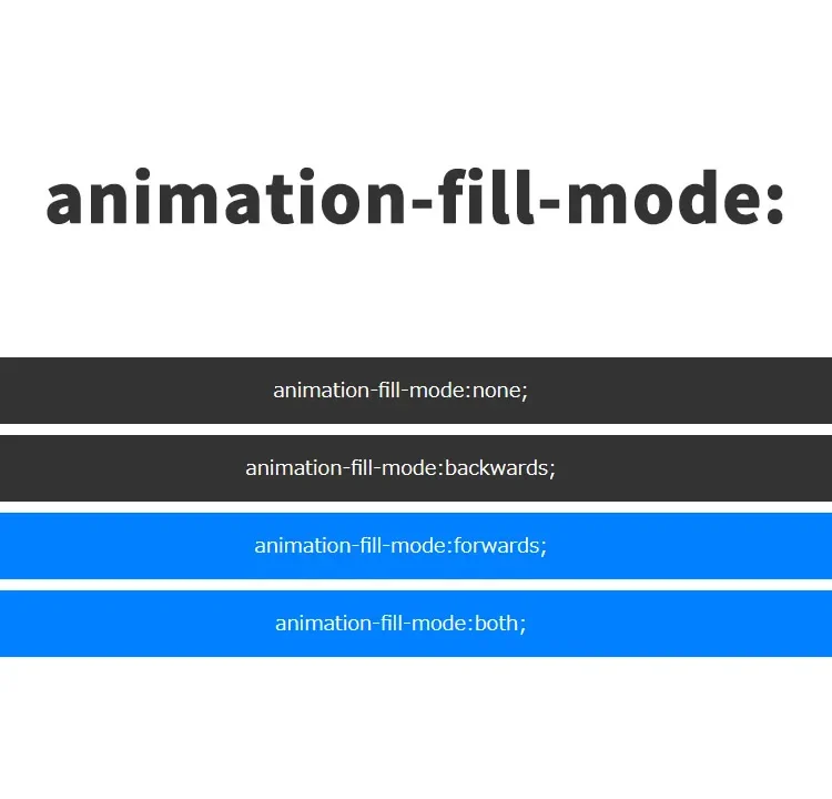
Four Values for animation-fill-mode
none (default)
This is the default value for animation-fill-mode. No special styles are applied before or after the animation, so the element appears in its normal, unanimated state.
backwards
Applies the styles defined at 0% in @keyframes during the animation delay.
The styles at the end of the animation (@keyframes) are not applied after completion.
forwards
Does not apply styles during the animation delay.
After the animation ends, the styles at 100% in @keyframes are applied.
In repeating animations, the styles at the end of the last iteration are applied.
both
Applies the styles at 0% during the animation delay, and the styles at 100% after the animation ends.
In repeating animations, the styles at the end of the last iteration are applied.
How to Write CSS with animation-fill-mode
Below are four patterns using animation-fill-mode: none, backwards, forwards, and both along with the @keyframes CSS definition.
<style>
*{
  padding: 0;
  margin: 0;
}
body{
  font-size: 18px;
  text-align: center;
}
h1{
  text-align: center;
  font-size: 20px;
  padding: 20px 0 40px 0;
  line-height: 1.8em;
}
input{
  padding: 15px;
}
.box{
  animation-name: animasample;
  animation-duration: 3s;
  animation-iteration-count: 1;
  animation-delay: 2s;
  animation-timing-function: ease-in;

  height: 60px;
  line-height: 60px;
  margin: 10px 0;
  color: #ffffff;
  background: #333333;
  display: block;
}
.modeNone{
  animation-fill-mode:none;
}
.modeBackwards{
  animation-fill-mode:backwards;
}
.modeForwards{
  animation-fill-mode:forwards;
}
.modeBoth{
  animation-fill-mode:both;
}
@keyframes animasample {
  0%{
    width: 30%;
    background: #D9D900;
  }
  50%{
    width: 50%;
    background: #4DFFA6;
  }
  100%{
    width: 100%;
    background: #0080FF;
  }
}
</style>
How to Write HTML with animation-fill-mode
The following HTML code shows examples of using different values for animation-fill-mode.
It also includes a button to reset and replay the animations.
There are five patterns: “No animation-fill-mode”, “none”, “backwards”, “forwards”, and “both”, and a button to reset the CSS animation.
<h1>Specified pre- and post-animation styles using animation-fill-mode.<br>Click the "Reset" button to re-run the CSS animation and observe the styles before and after.</h1>


  <input type="button" value="Reset" onclick="doAnime()">
  <br>
  <br>

  <div id="fillmodeArea">
    <div class="box">No animation-fill-mode</div>
    <div class="box modeNone">animation-fill-mode: none;</div>
    <div class="box modeBackwards">animation-fill-mode: backwards;</div>
    <div class="box modeForwards">animation-fill-mode: forwards;</div>
    <div class="box modeBoth">animation-fill-mode: both;</div>
  </div>
JavaScript to Reset the Animation
The following JavaScript code re-executes the animation when the reset button is clicked.
When the button is pressed, doAnime() is called and the HTML inside the element with id="fillmodeArea" is regenerated.
<script type="text/javascript">
<!--
function doAnime(){
  document.getElementById('fillmodeArea').innerHTML =
    '<div class="box">No animation-fill-mode</div>'+
    '<div class="box modeNone">animation-fill-mode: none;</div>'+
    '<div class="box modeBackwards">animation-fill-mode: backwards;</div>'+
    '<div class="box modeForwards">animation-fill-mode: forwards;</div>'+
    '<div class="box modeBoth">animation-fill-mode: both;</div>';
}
// -->
</script>
Demo Page: animation-fill-mode for Pre- and Post-Animation Styles
If you’d like to see the actual effect, please access the demo page from the link below.
Demo Page for Specifying Pre- and Post-Animation Styles Using animation-fill-mode
Conclusion
Using animation-fill-mode, you can effectively control styles before and after a CSS animation.
This allows you to maintain visual effects even after the animation ends.
*Please use this at your own risk if you reuse the content.
Do not reuse the Google Analytics tag inside the head tag of the demo page.