Bootstrap and Candlestick.js: How to Display Checkboxes as Switch-Style Designs
This time, we will introduce a method to make checkboxes more attractive.
Using the JavaScript library candlestick.js and the CSS framework Bootstrap, let’s learn how to design checkboxes in a switch-style format.
By using this technique, your UI will become much more refined.
Let’s get started!
CSS Description
First, load the required CSS and JavaScript files.
This includes bootstrap.min.css, font-awesome.min.css, and candlestick.css.
<link href="bootstrap.min.css" rel="stylesheet">
<link href="https://maxcdn.bootstrapcdn.com/font-awesome/4.4.0/css/font-awesome.min.css" rel="stylesheet">
<link href="candlestick.css" rel="stylesheet">
<style>
body{
  padding: 0;
  margin: 0;
  text-align: center;
  font-size: 16px;
}
h1{
  font-size:18px;
  line-height:1.6em;
  text-align:center;
  padding: 15px 0 25px 0;
}
</style>
HTML Description
Next, write the HTML.
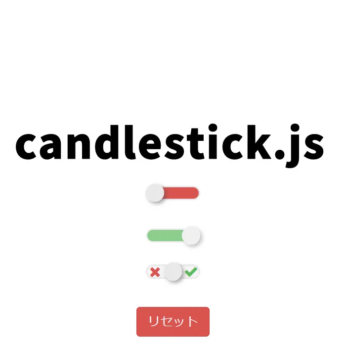
In the code below, three switch-style checkboxes (class=”js-candlestick”) and a reset button (id=”candle-reset”) are prepared.
<h1>Displaying checkboxes in a switch-style design using candlestick.js and Bootstrap.<br>Below are the checked (green) and unchecked (red) states. Clicking the "Reset" button will reset the checkboxes.</h1>


<div class="container">
    <div class="row">
        <div class="col-xs-12">
            <input class="js-candlestick" type="checkbox" name="test" value="off" id="test">
        </div>
    </div>
</div>

<br>

<div class="container">
    <div class="row">
        <div class="col-xs-12">
            <input class="js-candlestick" type="checkbox" name="truc[]" value="on" id="truc" readonly>
        </div>
    </div>
</div>

<br>

<div class="container">
    <div class="row">
        <div class="col-xs-12">
            <input class="js-candlestick" type="checkbox" name="machin" value="on" id="machin">
        </div>
    </div>

<br>

    <div class="row">
        <div class="col-xs-12">
            <a href="#" id="candle-reset" class="btn btn-danger">Reset</a>
        </div>
    </div>
</div>
JavaScript Description
Finally, load the necessary JavaScript files — jquery.min.js (v2.2.4), bootstrap.min.js, hammer.min.js, jquery.hammer.js, and candlestick.js — and write the code to make the checkboxes function as switch-style elements.
Write $(“checkbox area”).candlestick({options}).
In the options, you can enable swipe, configure states, etc.
Use $(“checkbox area”).candlestick(‘reset’) to reset checkbox states.
<script type="text/javascript" src="jquery.min.js"></script>
<script type="text/javascript" src="bootstrap.min.js"></script>
<script type="text/javascript" src="hammer.min.js"></script>
<script type="text/javascript" src="jquery.hammer.js"></script>
<script type="text/javascript" src="candlestick.js"></script>
<script type="text/javascript">
    jQuery.noConflict();

    jQuery(function($) {
        $(".js-candlestick").candlestick({
            swipe: {
                enabled: true,
                transition: true
            },
            on: 'on',
            off: 'off',
            nc: 'default',
            allowManualNc: false
        });

        $('#candle-reset').on('click', function(e) {
            e.preventDefault();

            $(".js-candlestick").candlestick('reset');
        });
    });
</script>
Demo Page: Displaying Checkboxes as Switch-Style Using candlestick.js and Bootstrap
A working demo page is also available. Please check it from the link below.
Demo page displaying checkboxes as switch-style using candlestick.js and Bootstrap
Source: candlestick
The source code for this project is available on GitHub.
If you are interested, feel free to check it out.
Summary
This is how to display checkboxes in a switch-style design using candlestick.js and Bootstrap.
With this, you can create a more visually appealing UI.
Please give it a try.
*If you reuse this code, please do so at your own risk.*
Please do not reuse the Google Analytics tag inside the head tag of the demo page.