CSS Flexbox Complete Guide: How to Make Box Heights Uniform Using align-items
Using CSS techniques, we’ll show you how to dramatically improve the look of your web design.
This time’s topic is “Making the height of multiple box areas uniform.”
This is especially useful when working with responsive design or Flexbox.
We’ll explain how to use CSS’s display:flex and align-items:stretch to make all box areas equal in height.
Why Is Matching Heights Important?
When placing multiple content boxes on a web page, inconsistent box heights can ruin the design and negatively impact user experience.
In websites with large amounts of information, consistency and alignment are crucial.
This is where the combination of CSS’s display: flex and align-items: stretch becomes useful.
How to Implement It with CSS
First, apply display: flex to the container that wraps everything.
This treats the child elements as flex items.
Then use align-items: stretch to make their heights equal.
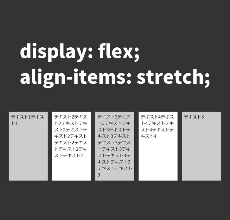
Here’s the CSS for the entire wrapper area (.flxbox) with display:flex and align-items:stretch (to match the tallest item), and the multiple box areas (.flxitem).
<style>
body{
  padding: 0;
  margin: 0;
}
h1{
  line-height:1.6em;
  text-align:center;
  font-weight:bold;
  padding: 15px 0 30px 0;
  font-size: 18px;
}
.flxbox {
    background-color: #333333;
    width: 800px;
    margin: 20px auto;
    display: flex;
    align-items: stretch;
}
.flxitem {
    padding: 8px;
    margin:  1%;
    width: 18%;
}
.flxitem:nth-child(1) {
    background-color:  #cccccc;
}
.flxitem:nth-child(2) {
    background-color:  #ffffff;
}
.flxitem:nth-child(3) {
    background-color: #cccccc;
}
.flxitem:nth-child(4) {
    background-color:  #ffffff;
}
.flxitem:nth-child(5) {
    background-color:  #cccccc;
}
</style>
Actual HTML Structure
Here’s a simple example using basic HTML structure.
The code below demonstrates a Flexbox layout with five box areas.
We prepare a wrapper area (class=”flxbox”) and five box areas (class=”flxitem”).
<h1>Align the heights of multiple box areas using CSS display:flex and align-items:stretch</h1>

<div class="flxbox">
    <div class="flxitem">
        Text 1 Text 1
    </div>
    <div class="flxitem">
        Text 2 Text 2 Text Text 2 Text Text 2 Text Text 2 Text Text 2 Text Text 2
    </div>
    <div class="flxitem">
        Text 3 Text 3 Text Text 3 Text Text 3 Text Text 3 Text Text 3 Text Text 3 Text Text 3
    </div>
    <div class="flxitem">
        Text 4 Text 4 Text Text 4 Text Text 4
    </div>
    <div class="flxitem">
        Text 5
    </div>
</div>
Demo Page: Aligning Multiple Box Heights Using CSS display:flex and align-items:stretch
To see this technique in action, we’ve prepared a demo page.
Please take a look at how it works in practice.
Demo page that aligns multiple box heights using CSS display:flex and align-items:stretch
Conclusion
This method is highly useful in various web design scenarios.
It’s especially handy when aligning boxes that contain different amounts of content.
With clever use of CSS, you can maintain visual consistency and professionalism while providing users with a comfortable browsing experience.
In the past, as introduced in the article “Complete Guide for Beginners: Easily Equalize Heights of Side-by-Side Elements with jquery.matchHeight.js“, JavaScript was often used to equalize heights.
But now, with display:flex and align-items:stretch, it can be done with just CSS.
* Use at your own risk if reusing this content.
Please do not reuse the Google Analytics tag found in the <head> section of the demo page.