Webサイトのデザインに動きを加えることで、ユーザーの視認性や操作性を向上させることができます。
本記事では、Caption Hover Effects(toucheffects.js、modernizr.custom.js)を使用して、画像にマウスオーバーするとテキストリンクが斜め前にアニメーション表示される方法を解説します。7種類の異なるアニメーションが用意されており、デザインに合わせてカスタマイズすることも可能です。
具体的なコードやデモページも紹介するので、ぜひ活用してみてください。
画像マウスオーバーでテキストリンクが斜め前にアニメーション表示するCSSの記述
※画像マウスオーバーエリア(.grid li)のCSS記述です。必要に応じて変更して下さい。
<style type="text/css">
h1{
  text-align: center;
  font-size: 20px;
  padding: 20px 0;
  line-height: 1.4em;
}
a{
    text-decoration: none;
}
a:hover{
    text-decoration: underline;
}
.grid {
    padding: 20px 20px 100px 20px;
    max-width: 1300px;
    margin: 0 auto;
    list-style: none;
    text-align: center;
}
.grid li {
    display: inline-block;
    width: 440px;
    margin: 0;
    padding: 20px;
    text-align: left;
    position: relative;
}
.grid figure {
    margin: 0;
    position: relative;
}
.grid figure img {
    max-width: 100%;
    display: block;
    position: relative;
}
.grid figcaption {
    position: absolute;
    top: 0;
    left: 0;
    padding: 20px;
    background: #2c3f52;
    color: #ed4e6e;
}
.grid figcaption h3 {
    margin: 0;
    padding: 0;
    color: #fff;
}
.grid figcaption a {
    text-align: center;
    padding: 5px 10px;
    border-radius: 2px;
    display: inline-block;
    background: #ed4e6e;
    color: #fff;
}
.cs-style-1 figcaption {
    height: 100%;
    width: 100%;
    opacity: 0;
    text-align: center;
    -webkit-backface-visibility: hidden;
    -moz-backface-visibility: hidden;
    backface-visibility: hidden;
    -webkit-transition: -webkit-transform 0.3s, opacity 0.3s;
    -moz-transition: -moz-transform 0.3s, opacity 0.3s;
    transition: transform 0.3s, opacity 0.3s;
}
.no-touch .cs-style-1 figure:hover figcaption,
.cs-style-1 figure.cs-hover figcaption {
    opacity: 1;
    -webkit-transform: translate(15px, 15px);
    -moz-transform: translate(15px, 15px);
    -ms-transform: translate(15px, 15px);
    transform: translate(15px, 15px);
}
.cs-style-1 figcaption h3 {
    margin-top: 70px;
}
.cs-style-1 figcaption span {
    display: block;
}
.cs-style-1 figcaption a {
    margin-top: 30px;
}

@media screen and (max-width: 31.5em) {
    .grid {
        padding: 10px 10px 100px 10px;
    }
    .grid li {
        width: 100%;
        min-width: 300px;
    }
}
</style>
画像マウスオーバーでテキストリンクが斜め前にアニメーション表示するHTMLの記述
※画像マウスオーバーエリア(ul.grid > li > figure)を用意します。画像マウスオーバーエリア(ul.grid > li > figure)対してアニメーション表示します。jpg画像(1.jpg ~ 4.jpg)を用意しました。
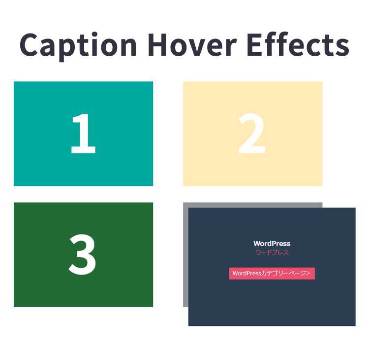
<h1>画像をマウスオーバーするとテキストリンクが斜め前にアニメーション表示されます</h1>

            <ul class="grid cs-style-1">
                <li>
                    <figure>
                        <img src="1.jpg" alt="img01">
                        <figcaption>
                            <h3>JavaScript</h3>
                            <span>ジャバスクリプト</span>
                            <a href="https://dad-union.com/category/javascript">JavaScriptカテゴリーページ></a>
                        </figcaption>
                    </figure>
                </li>
                <li>
                    <figure>
                        <img src="2.jpg" alt="img02">
                        <figcaption>
                            <h3>CSS</h3>
                            <span>シーエスエス</span>
                            <a href="https://dad-union.com/category/css">CSSカテゴリーページ></a>
                        </figcaption>
                    </figure>
                </li>
                <li>
                    <figure>
                        <img src="3.jpg" alt="img03">
                        <figcaption>
                            <h3>PHP</h3>
                            <span>ピーエイチピー</span>
                            <a href="https://dad-union.com/category/php">PHPカテゴリーページ></a>
                        </figcaption>
                    </figure>
                </li>
                <li>
                    <figure>
                        <img src="4.jpg" alt="img04">
                        <figcaption>
                            <h3>WordPress</h3>
                            <span>ワードプレス</span>
                            <a href="https://dad-union.com/category/wordpress">WordPressカテゴリーページ></a>
                        </figcaption>
                    </figure>
                </li>
            </ul>
Caption Hover Effects(toucheffects.js、modernizr.custom.js)を使って画像をマウスオーバーするとテキストリンクが斜め前にアニメーションするJavaScriptの記述
※modernizr.custom.js、toucheffects.jsファイルを読み込みます。
<script src="modernizr.custom.js"></script>
<script src="toucheffects.js"></script>
※以下toucheffects.jsファイル内(一部抜粋)では画像マウスオーバーエリア(ul.grid > li > figure)対してアニメーション表示する処理になってます。
~

		[].slice.call( document.querySelectorAll( 'ul.grid > li > figure' ) ).forEach( function( el, i ) {
			el.querySelector( 'figcaption > a' ).addEventListener( 'touchstart', function(e) {
				e.stopPropagation();
			}, false );
			el.addEventListener( 'touchstart', function(e) {
				classie.toggle( this, 'cs-hover' );
			}, false );
		} );

~
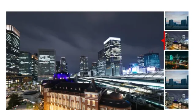
Caption Hover Effectsと使って画像をマウスオーバーするとテキストリンクが斜め前にアニメーション表示するデモページ
Caption Hover Effectsと使って画像をマウスオーバーするとテキストリンクが斜め前にアニメーション表示するデモページ
ソース元:Caption Hover Effects
以下がソース元です。
Caption Hover Effects
まとめ
Caption Hover Effectsを使えば、マウスオーバー時にテキストリンクをアニメーション表示する効果を簡単に実装できます。CSSとJavaScriptの少しの設定だけで、多彩なエフェクトを利用可能です。
本記事のサンプルコードを参考に、自分のWebサイトに動きを加えてみましょう。デザインの幅を広げ、より魅力的なサイト作りに役立ててください。
※流用される場合は自己責任でお願いします。
デモページheadタグ内のGoogleアナリティクスタグは流用しないで下さい。