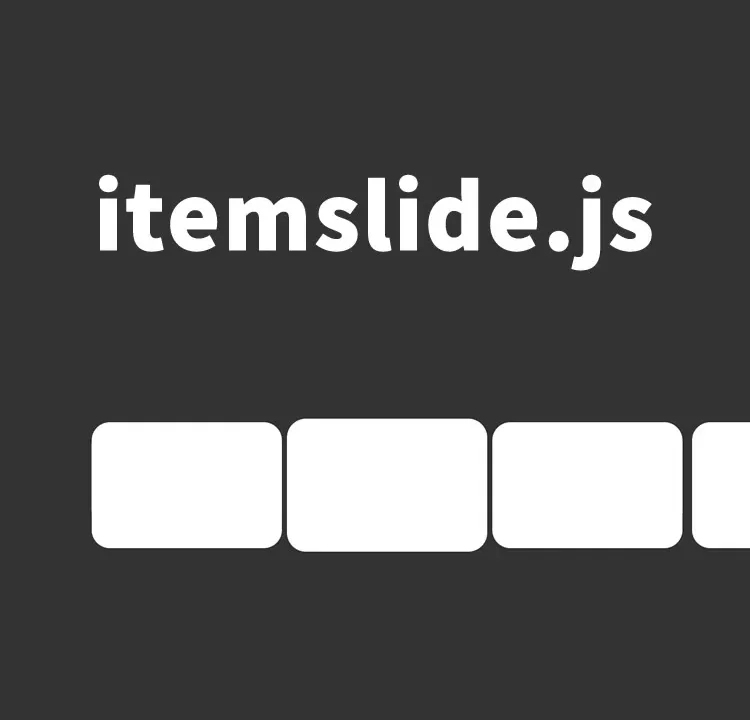
itemslide.js Implementation Method for Creating a Mobile-Friendly Slider with Swipe Functionality
itemslide.js is a powerful tool for creating interactive user experiences on websites and applications.
In this article, we will explain in detail how to implement a mobile-friendly slider using itemslide.js.
Whether you are a beginner or an advanced engineer, this article will be helpful — please use it as a reference.
Overview of itemslide.js
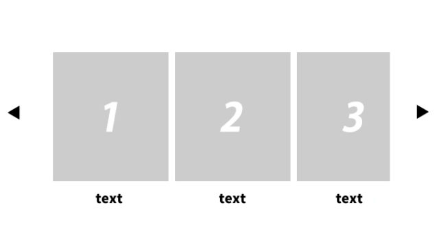
itemslide.js is a JavaScript library that allows you to easily implement a slider that supports touch operations.
It is especially optimized for mobile devices such as smartphones and tablets, supporting swipe, scroll, and click-based slide actions in all directions.
CSS Settings for the Slider
The CSS for displaying the slider should balance both visual appeal and usability.
Below is a basic CSS example for a slider using itemslide.js.
These are the CSS definitions for the slide area (#scrolling, ul, li, .itemslide-active).
<style>
body {
  font-size: 16px;
  text-align: center;
}
h1{
  text-align: center;
  font-size: 20px;
  padding: 20px 0 0 0;
  line-height: 1.8em;
}
#scrolling {
  position:fixed;
  top:28%;
  background: #333333;
  height: 34%;
  width: 100%;
  overflow: hidden;
}
ul {
  -webkit-user-select: none;
  -moz-user-select: none;
  -ms-user-select: none;
  user-select: none;
  margin: 0;
  padding: 0;
  position: absolute;
  margin-top:4vh;
  height:80%;
  list-style-type: none;
  -webkit-transform-style: preserve-3d;
  -ms-transform-style: preserve-3d;
  transform-style: preserve-3d;
}
li {
  font-size:8vmin;
  float: left;
  width:25vw;
  min-width: 250px;
  height: 100%;
  color: #333333;
  font-weight: 300;
  text-align: center;
  border-radius: 30px;
  -webkit-border-radius: 30px;
  -o-border-radius: 30px;
  -moz-border-radius: 30px;
  cursor: pointer;
  background: #FFF;
  -webkit-transform:  scale(0.95);
  -ms-transform:  scale(0.95);
  -moz-transform:  scale(0.95);
  transform: scale(0.95);
}
.itemslide-active {
  -webkit-transform:  scale(1);
  -ms-transform:  scale(1);
  -moz-transform:  scale(1);
  transform: scale(1);
}
</style>
HTML Structure
The HTML structure of the slider can be kept simple as shown below.
Inside the slide area (id=”scrolling”, ul), prepare multiple li tags that will slide.
Each li element includes actions such as swipe, scroll, and click.
<h1>Display a mobile-friendly slider with four-direction swipe using itemslide.js<br>Below, swipe up/down/left/right, scroll, or click to slide.</h1>

<div id="scrolling">
  <ul>
    <li>Swipe Left/Right</li>
    <li>Swipe Up/Down</li>
    <li>Scroll</li>
    <li>Click</li>
    <li>Mobile Friendly</li>
    <li>Swipe</li>
    <li>Swipe Up</li>
    <li>Scroll</li>
    <li>Click to Slide</li>
    <li>Mobile Friendly</li>
  </ul>
</div>
JavaScript Implementation
Load the jquery-3.6.4.min.js and itemslide.min.js files.
Write $(“slide area”).itemslide({options}).
In the options, configure settings such as enabling or disabling swipe.
The JavaScript code for itemslide.js is written as follows.
This activates the slider functionality and supports reloading when resizing.
<script src="jquery-3.6.4.min.js"></script>
<script src="itemslide.min.js"></script>
<script>
var carousel;

$(document).ready(function () {
    carousel = $("#scrolling ul");

    carousel.itemslide({
        swipe_out: true,
        remove_deprecated_external_functions: true
    });

    $(window).resize(function () {
        carousel.reload();
    });
});
</script>
Demo Page: Display a Mobile-Friendly Slider with Four-Direction Swipe Using itemslide.js
If you want to experience the slider in action, please access the demo page from the link below.
Demo Page: Display a Mobile-Friendly Slider with Four-Direction Swipe Using itemslide.js
Source: ItemSlide.js – JavaScript touch carousel
For more detailed information and implementation examples, please refer to the official site of itemslide.js.
ItemSlide.js – JavaScript touch carousel
Summary
By using itemslide.js, you can easily implement an interactive, mobile-friendly slider.
This library is especially suitable for mobile devices that make heavy use of touch operations.
Use the steps introduced in this article to apply it to your own website or application.
*If you reuse this code, please do so at your own risk.*
Do not reuse the Google Analytics tag in the demo page’s head section.