Switching a Hamburger (Three Lines) to a Cross (×) with CSS [For Mobile Menus]

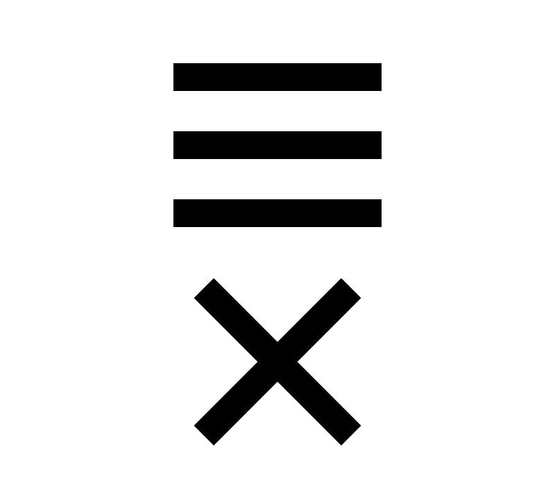
We will show you how to implement a “hamburger menu” often seen on websites and applications, where a three-line icon changes to a cross (×) when clicked. This is especially useful for devices like smartphones and tablets, making the most of limited screen space with a menu button.
This article explains how to toggle the menu button using jQuery’s toggleClass for an easy implementation. With basic knowledge of HTML, CSS, and JavaScript, you can set this up quickly. By reading this article, you’ll learn how to implement a hamburger menu. Let’s learn a skill that can be applied to creating smartphone and responsive design sites.
What is the Mechanism of the Hamburger (Three Lines) and Cross (×) Button?
Let’s first understand the basic mechanism of a hamburger menu. The three-line hamburger menu has a simple design yet is very intuitive. When clicked, it changes to a cross, signaling to users the option to “close” the menu.
This kind of visual toggle is achieved by changing the style with CSS and dynamically modifying it based on user actions with JavaScript. Specifically, by triggering a click event to add or remove CSS classes, the three lines rotate to form a cross. The next section will go over how this works in the actual code.
Setting Up the CSS for the Hamburger Menu
Here, we’ll set up the appearance of the hamburger menu with CSS. This CSS defines both the state with three lines and the state where it transforms into a cross upon being clicked. First, the menu itself is a 50px square box, with each line positioned within. The thickness and spacing of the lines can be adjusted according to your preference.
<style type="text/css">
body{
  font-family:Verdana,"Hiragino Kaku Gothic Pro","ヒラギノ角ゴ Pro W6",Osaka,"MS Pゴシック",Arial,sans-serif;
  padding: 0;
  margin: 0;
  overflow-x: hidden;
  line-height: 1.8em;
}
h1{
  font-size:18px;
  line-height:1.6em;
  text-align:center;
  font-weight:normal;
  padding:10px 0;
}

.menu{
    width: 50px;
    height: 50px;
    cursor: pointer;
    margin: 0 auto;
    position: relative;
}
.menu span{
    display: block;
    margin: 0;
    border: none;
    width: 50%;
    height: 3px;
    background: #000;
    transform-origin:0% 50%;
    position: absolute;
    top: 12px;
    left: 25%;
    transition: .3s;
}
.menu span:nth-of-type(2){
    top: 21px;
}
.menu span:nth-of-type(3){
    top: 30px;
}
.close span{
    left: 30%;
}
.close span:nth-of-type(1){
    transform: rotate(45deg);
    width: 52%;
}
.close span:nth-of-type(2){
    opacity: 0;
}
.close span:nth-of-type(3){
    top: 30px;
    transform: rotate(-45deg);
    width: 52%;
}
</style>
In this code, the .menu class represents the three-line state, and the .close class represents the cross state. Using the CSS transition property, the lines are set to rotate smoothly like an animation. Each line is precisely positioned with nth-of-type to ensure they align correctly.
Implementing the Menu Button in HTML
Next, let’s look at how to implement the menu button in HTML. Inside a div element, place three span tags, each representing one of the lines in the hamburger menu.
<div class="menu">
  <span></span>
  <span></span>
  <span></span>
</div>
This simple structure forms the basis of the hamburger menu. Each span tag is styled in CSS to create the three lines. With a click event in JavaScript, the close class is added to this div element, and the lines rotate to form a cross.
Controlling the Menu Button with JavaScript
Now, let’s handle it with JavaScript. Here, we’ll use jQuery to make it easy to control the hamburger menu. First, load the jQuery library (the jquery-2.2.0.min.js file), and switch classes when a click event occurs.
<script src="https://code.jquery.com/jquery-2.2.0.min.js" type="text/javascript"></script>
<script type="text/javascript">
$(function(){

    $(".menu").click(function() {
        $(this).toggleClass("close");
    });

});
</script>
This script is simple yet powerful. $(".menu") selects the menu button, and .click() sets the click event. By using toggleClass("close"), the close class is added or removed on each click, causing the three lines to transform into a cross with CSS.
Demo Page of the Menu Button that Switches the Hamburger (Three Lines) to a Cross (×) with CSS
Let’s try this code in action. Check the link below to see how the hamburger menu works. This example not only shows a simple hamburger menu implementation but also provides a function that can be used in various scenarios depending on your needs.
Demo of the Menu Button Switching Hamburger (Three Lines) to Cross (×)
Please try it out for yourself and experiment with various customizations based on this sample. For example, you can change the line color or adjust the animation speed to create a more unique and appealing menu button.
Summary
In this article, we showed how to create a simple hamburger menu by combining CSS and JavaScript. Such menu buttons are vital for user interfaces on smartphone sites and applications. By understanding the basic mechanics, you’ll acquire skills that can be applied in many different scenarios.
Moreover, by creatively designing animations, you can create user-friendly and visually appealing menu buttons. Based on this sample, try incorporating it into your own projects. By mastering the basics and applying your creativity, you can build more attractive websites.
※ Please take responsibility when reusing. Do not use the Google Analytics tag within the head tag for reuse.


