How to Make Text Bolder Using text-shadow in CSS, Beyond font-weight
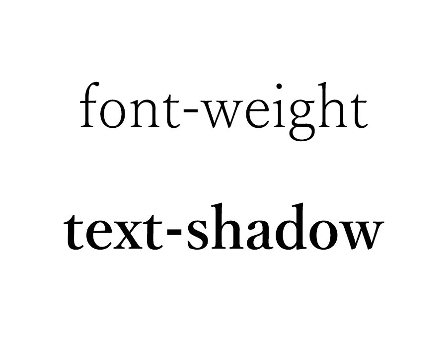
In the design of websites and applications, how you emphasize text visually is a crucial point. Typically, the CSS font-weight property is used to adjust the thickness of text, but there may be situations where you want to enhance its boldness even further. In such cases, by leveraging the text-shadow property, you can achieve a level of boldness that goes beyond what font-weight alone can offer.
This article introduces techniques to make text appear bolder using text-shadow. While font-weight alone has its limitations, combining it with text-shadow allows for more impactful text representations, enabling visually compelling designs.
However, excessive boldness may make text difficult to read, so it is important to maintain a moderate balance. Through this article, you will learn how to effectively use text-shadow and how to write the appropriate code to achieve it.
What is text-shadow?
The text-shadow property in CSS is used to add shadows to text. By applying this property, you can draw shadows around text, making it look three-dimensional or giving it a sense of depth. While text-shadow is often used for visual effects, it can also be used to make text appear thicker when set appropriately.
The basic syntax of text-shadow is as follows:
text-shadow: horizontal-offset vertical-offset blur-radius color;
For example, the following code adds a simple shadow to text:
text-shadow: 2px 2px 5px rgba(0, 0, 0, 0.5);
By tweaking this syntax, you can layer shadows to make text appear thicker.
CSS Code for Making Text Bolder Using text-shadow
Here is the CSS code to make text appear bolder using text-shadow. In this example, multiple shadows are specified for the text, effectively thickening its outline. By creatively layering shadows, you can create bolder text.
<style>
body {
  font-family: 'Yu Mincho', 'Hiragino Mincho Pro', serif;
  padding: 0;
  margin: 0;
  font-size: 24px;
  text-align: center;
}
h1 {
  line-height: 1.6em;
  text-align: center;
  font-weight: normal;
  padding: 10px 0;
  font-size: 24px;
}
.txt1 {
  font-weight: normal;
}
.txt2 {
  font-weight: bold;
}
.txt3 {
  font-weight: normal;
  text-shadow: .5px .5px #000, -.5px .5px #000, -.5px -.5px #000, .5px -.5px #000, .5px 0px #000, 0px .5px #000, -.5px 0px #000, 0px -.5px #000;
}
.txt4 {
  font-weight: normal;
  text-shadow: 1px 1px #000, -1px 1px #000, -1px -1px #000, 1px -1px #000, 1px 0px #000, 0px 1px #000, -1px 0px #000, 0px -1px #000;
}
.txt5 {
  font-weight: bold;
  text-shadow: 1px 1px #000, -1px 1px #000, -1px -1px #000, 1px -1px #000, 1px 0px #000, 0px 1px #000, -1px 0px #000, 0px -1px #000;
}
</style>
This CSS uses text-shadow to set shadows in multiple directions, combining them to make the text thicker. Each class—txt3, txt4, and txt5—demonstrates different shadow settings, allowing you to observe variations in text thickness. Adjusting pixel values and colors further enhances the visual effects.
HTML Code for Applying text-shadow
Below is the HTML code that applies the above styles, demonstrating how they appear when rendered. This example uses the provided CSS to create a demo.
<h1>Demonstrating Bold Text Using text-shadow</h1>
<br>
<br>
<div class="txt1">Text thickness: font-weight: normal;</div>
<br>
<br>
<div class="txt2">Text thickness: font-weight: bold;</div>
<br>
<br>
<div class="txt3">Text thickness: font-weight: normal; with text-shadow outline (0.5px).</div>
<br>
<br>
<div class="txt4">Text thickness: font-weight: normal; with text-shadow outline (1px).</div>
<br>
<br>
<div class="txt5">Text thickness: font-weight: bold; with text-shadow outline (1px).</div>
Demo Page for Bolder Text Using text-shadow
You can view the implementation on the following demo page:
Demo of Making Text Bolder Using text-shadow
Conclusion
Adjusting text thickness using text-shadow expands the design possibilities beyond what font-weight can achieve. It is a valuable technique for adding visual emphasis and variety to text. By adding appropriate shadows, you can create impactful designs while maintaining readability.
However, excessive use of shadows may reduce text clarity, so it’s important to strike a balance. Depending on your design needs, fine-tune the text-shadow offsets, colors, and blur radius to find the optimal settings.
By using the methods introduced here, you can make text appear bolder and more visually engaging. Try it out in various projects and incorporate the right text thickness and shadow effects to match your design.
※ Please use this method at your own discretion. Avoid copying Google Analytics tags from the head section.
