初心者向け!animatedModal.jsで魅力的なアニメーションモーダルを簡単に作成する完全ガイド
Web開発の現場では、ユーザーの注意を引きつける要素としてモーダルウィンドウが頻繁に使用されます。
今回は、アニメーションを取り入れたモーダル表示に特化したJavaScriptライブラリ、animatedModal.jsを使った具体的な実装方法を分かりやすく解説します。これにより、ユーザーの体験を向上させることが可能です。
はじめに
animatedModal.jsは、シンプルながらも効果的なアニメーション効果をモーダルウィンドウに適用できるJavaScriptライブラリです。このライブラリを使用することで、モーダルウィンドウの開閉時に様々なアニメーションを設定できます。本記事では、基本的な導入方法から、カスタマイズ例までを一つ一つ丁寧に説明していきます。
必要なファイル
animatedModal.jsを利用する前に、以下のファイルをプロジェクトに追加する必要があります。
- animate.min.css – アニメーション効果のスタイルシート
- jQuery – JavaScriptライブラリ
- animatedModal.js – モーダルにアニメーション機能を追加するスクリプト
HTMLの基本構造
まずは、モーダルウィンドウを動作させるためのHTMLマークアップを準備します。モーダルを開くトリガーとなるリンクと、モーダルコンテンツを格納するコンテナが必要です。
モーダル表示リンク(id=”demo01″、id=”demo02″)とモーダルエリア(id=”demo1-modal”、id=”demo2-modal”)を用意します。モーダル表示リンクタグのhref(href=”#demo1-modal”、href=”#demo2-modal”)と表示するモーダルエリアのid(id=”demo1-modal”、id=”demo2-modal”)を一致させる必要があります。
<h1>animatedModal.jsを使ってモーダル画面をアニメーション演出で表示</h1>

<div><a id="demo01" href="#demo1-modal">ココをクリックするとモーダル1を表示</a></div>
<br>
<div><a id="demo02" href="#demo2-modal">ココをクリックするとモーダル2を表示</a></div>

<div id="demo1-modal">
  <div  id="btn-close-modal" class="close-demo1-modal">
  ココをクリックするとモーダル1をCLOSE
  </div>

  <div class="modal-content">
  モーダル1のコンテンツエリアです。
  </div>
</div>


<div id="demo2-modal">
  <div  id="btn-close-modal" class="close-demo2-modal">
  ココをクリックするとモーダル2をCLOSE
  </div>

  <div class="modal-content">
  モーダル2のコンテンツエリアです。
  </div>
</div>
CSSの設定
モーダルウィンドウとボタンの基本的なスタイリングを行います。ここでは、animate.min.cssを利用してアニメーションの準備をします。
「#btn-close-modal」はモーダルエリアの閉じるボタンのCSS記述です。
<link rel="stylesheet" href="animate.min.css">
<style>
* {
  padding: 0;
  margin: 0;
}
body {
  font-size: 18px;
  text-align: center;
}
h1{
  text-align: center;
  font-size: 24px;
  padding: 20px 0 40px 0;
}
#btn-close-modal {
  width:100%;
  text-align: center;
  cursor:pointer;
  color:#fff;
  text-decoration: underline;
  padding: 20px 0 40px 0;
}
</style>
JavaScriptの実装
jquery-3.4.1.min.jsファイルとanimatedModal.jsを読み込んだ後、具体的なアニメーション設定をJavaScriptで記述します。ここでは、animatedInとanimatedOutでアニメーションの種類を指定できます。
$(“モーダルエリアid”).animatedModal(オプション)を指定します。オプションではモーダル画面の表示演出方法やモーダル表示前後とCLOSE前後の処理を設定出来ます。
<script src="jquery-3.4.1.min.js"></script>
<script src="animatedModal.js"></script>
<script>
$("#demo01").animatedModal();

$("#demo02").animatedModal({
  animatedIn:'lightSpeedIn',
  animatedOut:'bounceOutDown',
  color:'#3498db',
  //以下にモーダル表示前後とCLOSE前後の処理を記述
  beforeOpen: function() {
  },
  afterOpen: function() {
  },
  beforeClose: function() {
  },
  afterClose: function() {
  }
});
</script>
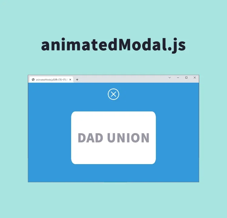
animatedModal.jsを使ってモーダル画面をアニメーション演出で表示するデモページ
実際にこれらのコードを動作させるデモページにアクセスするリンクは以下です。
animatedModal.jsを使ってモーダル画面をアニメーション演出で表示するデモページ
ソース元:animatedModal.js
animatedModal.jsの詳細なドキュメントにアクセスするリンクは以下です。
まとめ
この記事では、animatedModal.jsを使用して、魅力的なアニメーション付きのモーダルウィンドウを簡単に実装する方法を紹介しました。初心者でも手軽に利用でき、サイトのユーザー体験を格段に向上させることが可能です。是非この機会に試してみてください。
※流用される場合は自己責任でお願いします。
デモページheadタグ内のGoogleアナリティクスタグは流用しないで下さい。
PCトラブルは解決しましたか?
もし「会社のPCが全部遅い」「Office 365のエラーが多発する」「ネットワークが不安定」といった、調べても解決しない「会社全体」のお悩みがありましたら、ぜひご相談ください。
「Windows11 高速化」といったお悩み検索で毎月1,200人以上が訪れる、
このサイトの運営者(建設会社IT部長)が、川崎・横浜・東京城南エリアの法人様限定で「無料ITお困りごと診断」を行っています。