CSS keyframes Guide: Implementing Fade-In from Bottom to Top
In the world of web design, small details can make a big difference. Today, we’ll introduce a fade-in effect using CSS keyframes. This simple yet effective technique helps grab users’ attention and enhances the website experience.
What is a Fade-In Effect?
The fade-in effect is an animation where elements gradually appear. It is especially useful for emphasizing important content or calls to action. With CSS keyframes, this effect can be easily implemented.
Implementing Fade-In with keyframes
Using CSS keyframes allows elements to appear smoothly. Follow the steps below to implement this effect.
Prepare the CSS
First, write CSS for the elements you want to fade in.
We’ll prepare a fade-in area (.mv) and the animation effect from bottom to top (.fade-up, @keyframes fadeinup).
Here, the .mv class targets the element to fade in, and .fade-up controls the animation.
<style>
body{
padding: 0;
margin: 0;
text-align:center;
}
h1{
line-height:1.6em;
text-align:center;
font-weight:bold;
padding: 15px 0 30px 0;
font-size: 18px;
}
.mv{
width: 300px;
height: 44px;
margin: 0 auto;
font-size: 32px;
background-color: #333333;
color: #ffffff;
}
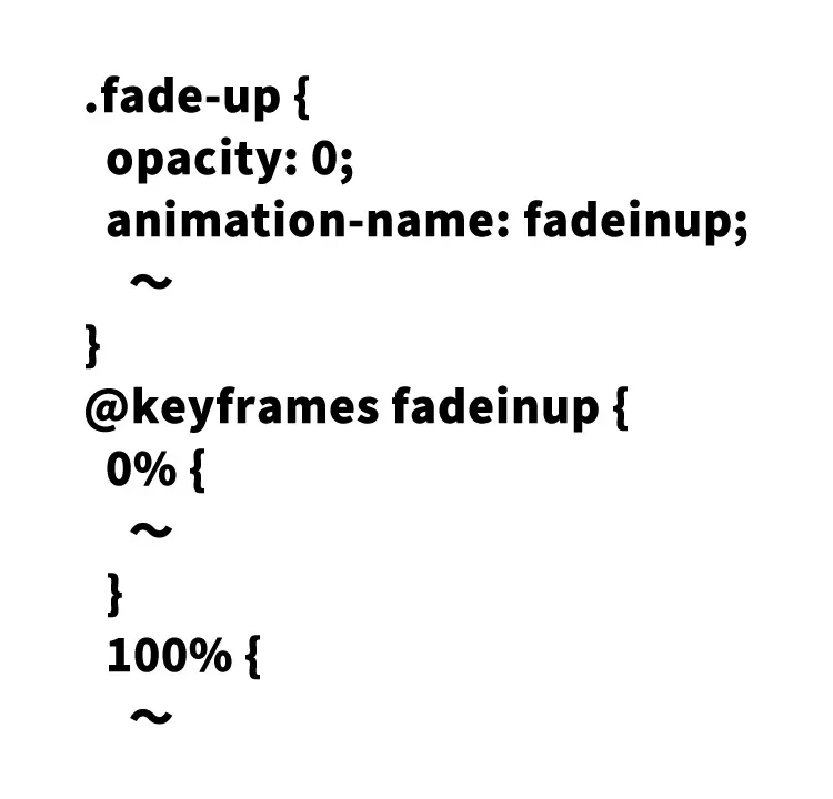
.fade-up {
opacity: 0;
animation-name: fadeinup;
animation-duration: 1.6s;
animation-delay: .4s;
animation-timing-function: ease-out;
animation-fill-mode: forwards;
}
@keyframes fadeinup {
0% {
opacity: 0;
transform: translateY(20px);
}
100% {
opacity: 1;
transform: translateY(0);
}
}
</style>
Write the HTML
Next, set the appropriate class on the HTML elements you want to animate.
To create a fade-in effect from bottom to top, apply the .fade-up class to the desired area.
<h1>Fade In from Bottom with CSS Only [keyframes]</h1>

  <div class="mv fade-up">
    <div class="fade-up">DAD UNION</div>
  </div>
Demo Page: Fade-In from Bottom with CSS Only [keyframes]
Check out the demo page below to see the effect in action.
Demo Page using blurify.js to blur images
Why is This Technique Important?
Animations enrich user experiences in web design. Especially fade-in effects draw attention and help deliver messages effectively. CSS animations with keyframes enable creative expression using coding skills.
Conclusion
Using CSS keyframes for fade-in effects brings depth and motion to your website with simplicity. This is a great example of combining technical knowledge with creativity in web design. Why not try enhancing your site’s appeal by referring to this guide?
*If you reuse this content, please do so at your own risk.
Do not reuse the Google Analytics tag inside the <head> tag of the demo page.