Complete Guide to Responsive Three-Column Layout and Dynamic Font Size Adjustment with CSS calc() Function

In the world of web design, aesthetics and usability are crucial. Here, we introduce a design technique using the CSS calc() function. This function helps dynamically calculate sizes and values to create responsive designs.
In this guide, we will explain how to divide an area into three equal parts and adjust the font size according to the browser size.
CSS allows specifying sizes for width, height, and font-size, but using calc() enables relative sizing based on the browser’s dimensions.
Using CSS calc() for Three-Column Layout and Dynamic Font Size Adjustment
With the calc() function, you can change font size based on the viewport (browser display area) width. Additionally, you can use the .box class inside the .wrap class to divide the area into three equal parts.
In the example below, the font size is dynamically adjusted in the body tag based on the viewport width, while the .wrap area is divided into three .box sections.
<style type="text/css">
body{
  padding: 0;
  margin: 0;
  font-size: calc(100vw / 30);
}
h1{
  line-height:1.6em;
  text-align:center;
  font-weight:normal;
  padding:15px 0 30px 0;
  font-size: 16px;
}
.wrap{
  width: 92%;
  margin: 0 auto;
}
.box{
    width: calc(100% / 3);
    float: left;
    height: 200px;
    background-color: #FFBFBF;
    text-align: center;
    border: solid 1px #FF4D4D;
    box-sizing:border-box;
    font-weight: bold;
    line-height: 200px;
}
</style>
HTML Markup
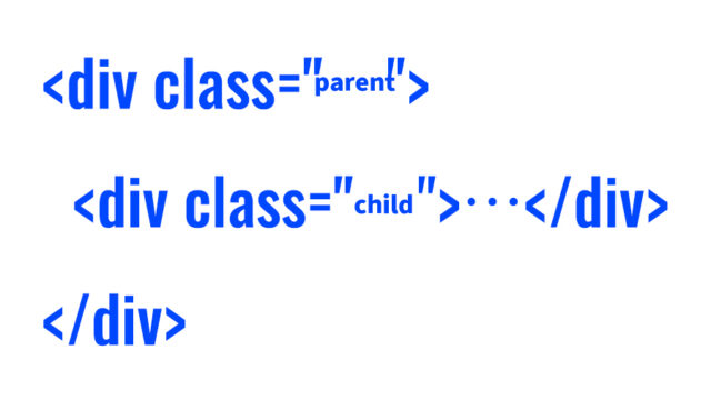
Inside the class="wrap" tag, we have included three class="box" tags.
<h1>The area with a width of 92% of the browser is divided into three parts, and the font size of each section changes depending on the browser size</h1>

<div class="wrap">
  <div class="box">BOX1</div>
  <div class="box">BOX2</div>
  <div class="box">BOX3</div>
</div>
Live Demo Page
We have prepared a demo page demonstrating this CSS technique. Check it out via the link below:
Conclusion
By using the CSS calc() function, you can dynamically adjust designs according to the browser size. This allows for the creation of responsive web designs adaptable to various devices.
Designers and engineers, make use of this technique to build more attractive websites.
Note: If you reuse this technique, please do so at your own risk. Do not copy the Google Analytics tag included in the head tag of the demo page.