gap-based Modern CSS Techniques: A Complete Guide to Grid Layouts Without Margin
This article explains how to use the “gap” property in CSS to define spacing in grid layouts and flexboxes. By using this technique, you can break free from traditional margin or float-based spacing, enabling simpler and more intuitive layout creation. However, please note that this method is not supported in Internet Explorer.
CSS Description
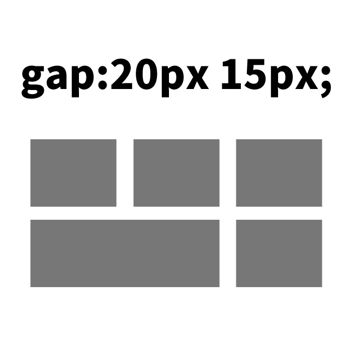
In CSS, we define a flexbox area (class: .flexarea) using display: flex, and a grid layout area (class: .gridarea) using display: grid. In both layouts, multiple div elements are arranged in a grid pattern, and spacing is defined using the gap property for consistent horizontal and vertical margins.
<style>
<!--
body{
  padding: 0;
  margin: 0;
}
h1{
  text-align:center;
  padding: 30px 0;
  font-size: 18px;
}
h2{
  font-size: 18px;
}
.wrap{
  width: 600px;
  margin: 0 auto;
}
.flexarea {
  display: flex;
  flex-wrap: wrap;
  width: 600px;
  gap: 20px 30px;
}
.flexarea > div {
  border: 1px solid #000000;
  background-color: #cccccc;
  flex: 1 1 auto;
  width: 100px;
  height: 90px;
}
.gridarea {
  display: grid;
  height: 300px;
  grid-template: repeat(3, 1fr) / repeat(3, 1fr);
  gap: 30px 20px;
}
.gridarea > div {
  border: 1px solid #333333;
  background-color: #ffffff;
}
-->
</style>
This approach allows you to specify spacing more easily and consistently.
HTML Description
In HTML, apply the CSS classes defined above. For example, a layout using flexbox is described as follows:
<h1>Creating Grid Layouts Without Margins Using CSS gap with Grid and Flex</h1>

<div class="wrap">

<h2>Grid Layout Using display:flex</h2>
<div class="flexarea">
  <div></div>
  <div></div>
  <div></div>
  <div></div>
  <div></div>
  <div></div>
</div>

<br>

<h2>Grid Layout Using display:grid</h2>
<div class="gridarea">
  <div></div>
  <div></div>
  <div></div>
  <div></div>
  <div></div>
  <div></div>
  <div></div>
  <div></div>
  <div></div>
</div>

</div>
Similarly, a layout using grid can be created by applying the defined classes.
Demo Page
You can check the actual behavior on the demo page. Access it from the link below:
Grid Layout Demo Page Using gap Without margin in grid and flex
Conclusion
Using this method, you can create efficient and intuitive layouts without relying on margin for spacing. It’s especially effective for evenly spaced element designs. While keeping in mind that it’s not supported in older browsers, take advantage of this modern web development technique.
※ Use at your own risk if reusing this content.
Please do not copy the Google Analytics tag inside the head tag of the demo page.