CSS linear-gradient: How to Add a Stylish Split Background Effect to Your Web Page
In the world of web design, it is important to capture users’ attention and create visuals that leave a lasting impression.
In this article, we focus on one of CSS’s powerful features, linear-gradient, and explain in detail how to set different background colors on the left and right halves of an area.
Basics of linear-gradient
CSS linear-gradient is a feature that creates smooth color transitions in backgrounds. By using it, you can apply a gradient effect in which colors change gradually. In addition to single colors, you can combine multiple colors or specify angles to achieve a wide variety of visual designs.
How to Set Background Colors
Below, we explain how to set a background color using linear-gradient for an area (.wrap) with width:100%.
The syntax of linear-gradient is as follows:
linear-gradient(angle deg, start color start position %, color until midway position %, start color from midway start position %, end color end position %)
<style>
body{
  padding: 0;
  margin: 0;
}
h1{
  padding: 20px 0;
  font-size: 18px;
  text-align:center;
  font-weight:bold;
}
.wrap{
  width: 100%;
  height: 500px;
  background:linear-gradient(90deg, #8ed2dd 0%, #8ed2dd 50%, #cccccc 50%, #cccccc 100%);
  overflow: hidden;
}
.box{
  width: 50%;
  float: left;
  font-size: 30px;
  text-align: center;
  padding-top: 240px;
}
</style>
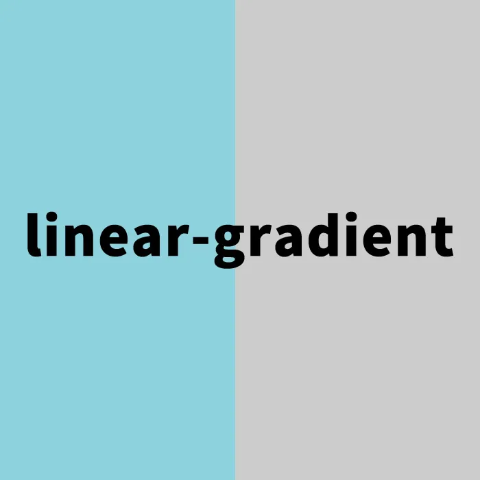
With this description, the left half of the area will be colored #8ed2dd, and the right half will be colored #cccccc. By setting the angle to 90deg, a gradient from left to right is achieved.
Setting the HTML Structure
Next, prepare an area with a background color applied using linear-gradient (class=”wrap”), and inside it, box areas divided into 50% on the left and right.
<h1>Set different background colors on the left and right halves (50%) of the area below using linear-gradient</h1>

<div class="wrap">
  <div class="box">Left Area</div>
  <div class="box">Right Area</div>
</div>
Demo Page: Setting Different Background Colors on the Left and Right Halves (50%) Using linear-gradient
On the demo page below, you can see an actual example of applying background colors using linear-gradient. Please take a look to help expand your design ideas.
Summary and Applications
In this article, we introduced the basic method of setting background colors using linear-gradient. This feature is highly versatile and can be applied in many ways, such as creating more complex gradients or combining them with background images. To attract users visually, make full use of this technique and create engaging web designs.
*Please use this at your own risk if you reuse it.
Do not reuse the Google Analytics tag included in the head tag of the demo page.*