Digital-Age Web Design: From Understanding Resolution to Choosing the Right Tools
In web page coding, let’s take a detailed look at how to think about resolution (DPI) and pixels (PX), how web pages are displayed across different devices (PC: Windows & Mac, smartphones: iPhone & Android), and the characteristics, advantages, and disadvantages of various tools (Photoshop, Illustrator, XD, Figma, etc.) when coding web pages from design data.
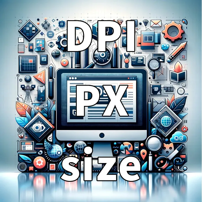
What Is Resolution (DPI)?
Definition: DPI (Dots Per Inch) represents the number of dots (pixels) per inch. It is mainly used for printed materials and serves as an indicator of image clarity.
Web and DPI: In web design, 72dpi or 96dpi is generally considered the standard. However, as display resolutions increase, it becomes necessary to take higher DPI into account.
Thinking About Resolution in Pixels
Pixels (PX): In digital and web design, resolution is considered in pixel units. Pixels are the smallest units on a screen.
Relationship: The higher the DPI, the sharper the image appears even with the same number of pixels. However, on the web, pixel dimensions are more important than DPI.
Web Design for PC Screens
Windows
On many Windows devices, 96dpi is common. In web design, a width of 1920px is generally used as a standard.
Mac
Mac devices use Retina displays with higher resolution, so web design must take double-resolution displays into account.
Common Resolutions for Mac
- Typical resolutions:
Mac display resolutions vary by model. For example, a 1440px MacBook effectively requires a design resolution of 2880px. A 27-inch iMac has a resolution of 5120 x 2880 pixels. - Considerations for web design:
When designing for the web, these high resolutions should be considered. Images and elements should be prepared at larger sizes and adjusted to appropriate display resolutions using CSS media queries.
Web Design for Smartphone Screens
iPhone
iPhones use Retina displays. When designing, it is necessary to consider sizes that are 2x or 3x the actual resolution.
iPhone Resolution Example (iPhone 14)
- iPhone 14 resolution:
The standard iPhone 14 model has a resolution of 2532 x 1170 pixels. - PX width for web design:
Taking the Retina display into account, it is ideal to design at twice the actual pixel resolution, which would be 5064 x 2340 pixels. However, it is not necessary to design the entire layout at this size—preparing key content and images in high resolution is what matters most.
Android
Since resolutions vary by device, flexible design is required. Typically, medium density (mdpi) is used as a base, and designs are scaled up for hdpi, xhdpi, xxhdpi, and beyond.
Android Resolution Example (Google Pixel 7)
- Google Pixel 7 resolution:
The Google Pixel 7 has a resolution of 2400 x 1080 pixels. - PX width for web design:
Because Android device resolutions can vary, designs are generally based on medium density (mdpi) and scaled using multipliers (hdpi, xhdpi, xxhdpi, etc.). For the Pixel 7, images and elements should be prepared at 2400 x 1080 pixels and scaled as needed.
Coding Web Pages from Design Data
Tool Selection
The choice of tools for web design and coding greatly impacts project outcomes. Common tools include Photoshop, Illustrator, Adobe XD, and Figma. Let’s take a closer look at the characteristics, advantages, and disadvantages of each.
Photoshop
Advantages:
- Offers powerful image editing capabilities, allowing for detailed visual adjustments.
- A wide range of plugins and resources are available.
Disadvantages:
- Not specialized for web design, so layout and prototyping features are limited.
- A relatively heavy application that consumes significant system resources.
Illustrator
Advantages:
- Ideal for vector-based design, making it suitable for logos and icon creation.
- Easy to resize while maintaining high-quality graphics.
Disadvantages:
- Not suitable for designing full web page layouts.
- Lacks the advanced image editing capabilities of Photoshop.
Adobe XD
Advantages:
- Specialized in UI design and prototyping.
- Seamless integration with Adobe Creative Cloud.
- Lightweight and easy-to-use interface.
Disadvantages:
- Does not offer the same level of detailed image editing as Photoshop or Illustrator.
- Feature set may be limited compared to other tools.
Figma
Advantages:
- Web-based and easily accessible, enabling smooth team collaboration.
- Advanced prototyping and animation capabilities.
- Supports real-time feedback and collaborative work.
Disadvantages:
- Offline work capabilities are limited.
- Does not offer image editing features as advanced as Photoshop or Illustrator.
The choice of tools depends on project requirements, team skills, and the type of work involved. Photoshop and Illustrator are well-suited for image editing and vector-based graphics, while dedicated tools like XD and Figma are better suited for full web layouts and prototyping.
Adjusting Resolution
Adjust designs according to the resolution of each device, paying special attention to high-resolution displays.
Responsive Design
Aim for designs that adapt to different devices and screen sizes.
Preparing Assets
Prepare assets such as images and icons in multiple resolutions as needed.
Notes on Coding
Striving for pixel-perfect precision can be time-consuming, so it is important to remain flexible and understand implementation constraints.
Conclusion
For Mac, iPhone, and Android devices, resolution is a critical element of web design. By understanding device resolutions and designing with appropriate sizes and techniques, you can deliver a better user experience. Especially on high-resolution displays, it is essential to prepare images and elements at suitable sizes.
※Please use this information at your own discretion and responsibility.